Guiding Beacon
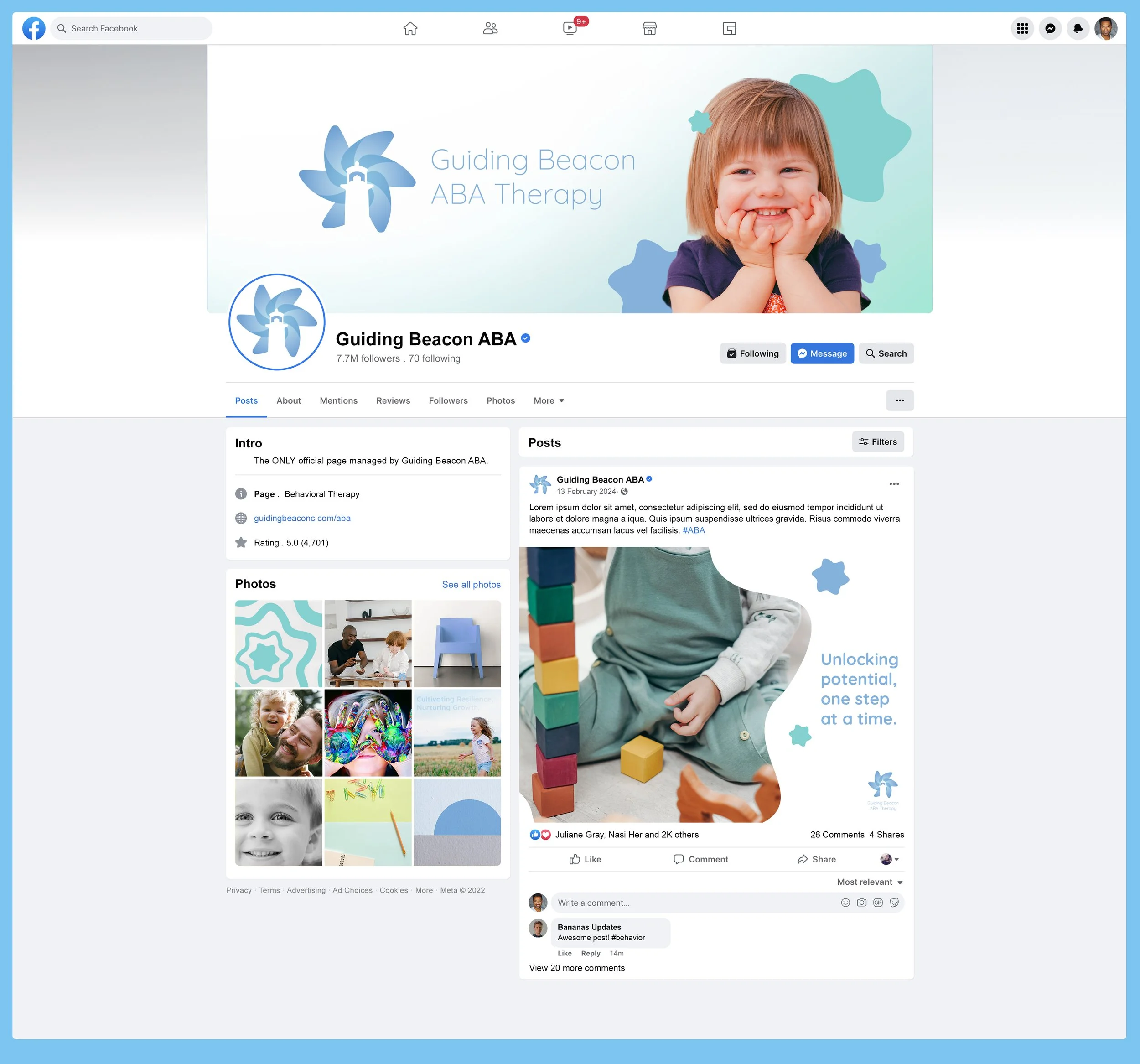
This brand was designed for an Applied Behavior Therapy practice, aiming to provide a calming, welcoming atmosphere for both children and their parents. The soft, pastel color palette of greens and blues evokes a sense of peace and reassurance, helping to ease anxiety and create a soothing environment. The brand’s logo, featuring a lighthouse with a pinwheel behind it, symbolizes both guidance and growth. The lighthouse represents stability and direction, while the pinwheel adds a playful element, signifying the joy and development children experience through therapy. Though the colors are subtle, the brand remains vibrant and distinct, standing out in a field where trust and compassion are essential. Please note: this concept was developed as part of a school project and has not been implemented in the real world.


